BGI Afbouw & Stucadoors
Plastering & finishing • Web development & design • SEO & GEO foundation • CRO (conversion optimisation)From an outdated website to a professional online foundation
Services
The challenge
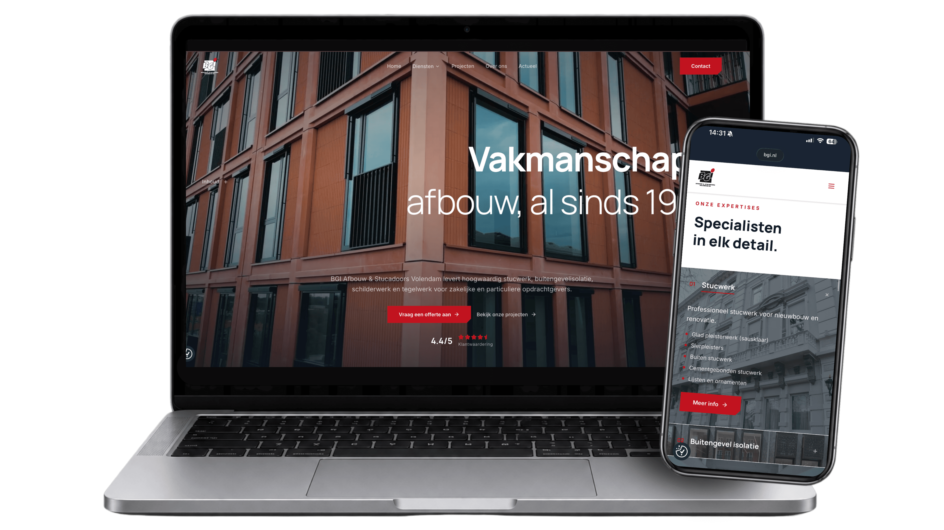
BGI Afbouw & Stucadoors of Volendam wanted to grow in the business market, but the existing website did not match that ambition. The technology was dated, the structure was not right for findability, and business visitors therefore had a harder time finding their way. Google Ads costs were climbing too, while results from the website were flattening out. BGI needed a website that presents its broad range of services clearly and is structurally easier to find. schurq. therefore built a new website on a headless architecture, with a structure ready for organic growth.
Scope: web design & development, migration to a headless architecture, quote flow, SEO/GEO foundation and content production.
Key challenges:
- Outdated technology: the existing website was no longer fit as a foundation for SEO and GEO.
- A model that would not scale: Google Ads filled the gap, with flattening results and a rising cost per lead.
- Sharper focus on the business market: the presence had to become crisp, businesslike and partly corporate, aimed at larger projects.
- Opening up a broad service offering: four disciplines, each with its own specialisms, each to be found on its own.
The process
BGI wanted to look further than repairing the existing website. The ambition was a solid foundation for continued organic growth. So we built a new website with a clear content structure per service, and an editing environment BGI can carry on with independently.
Positioning for the business market
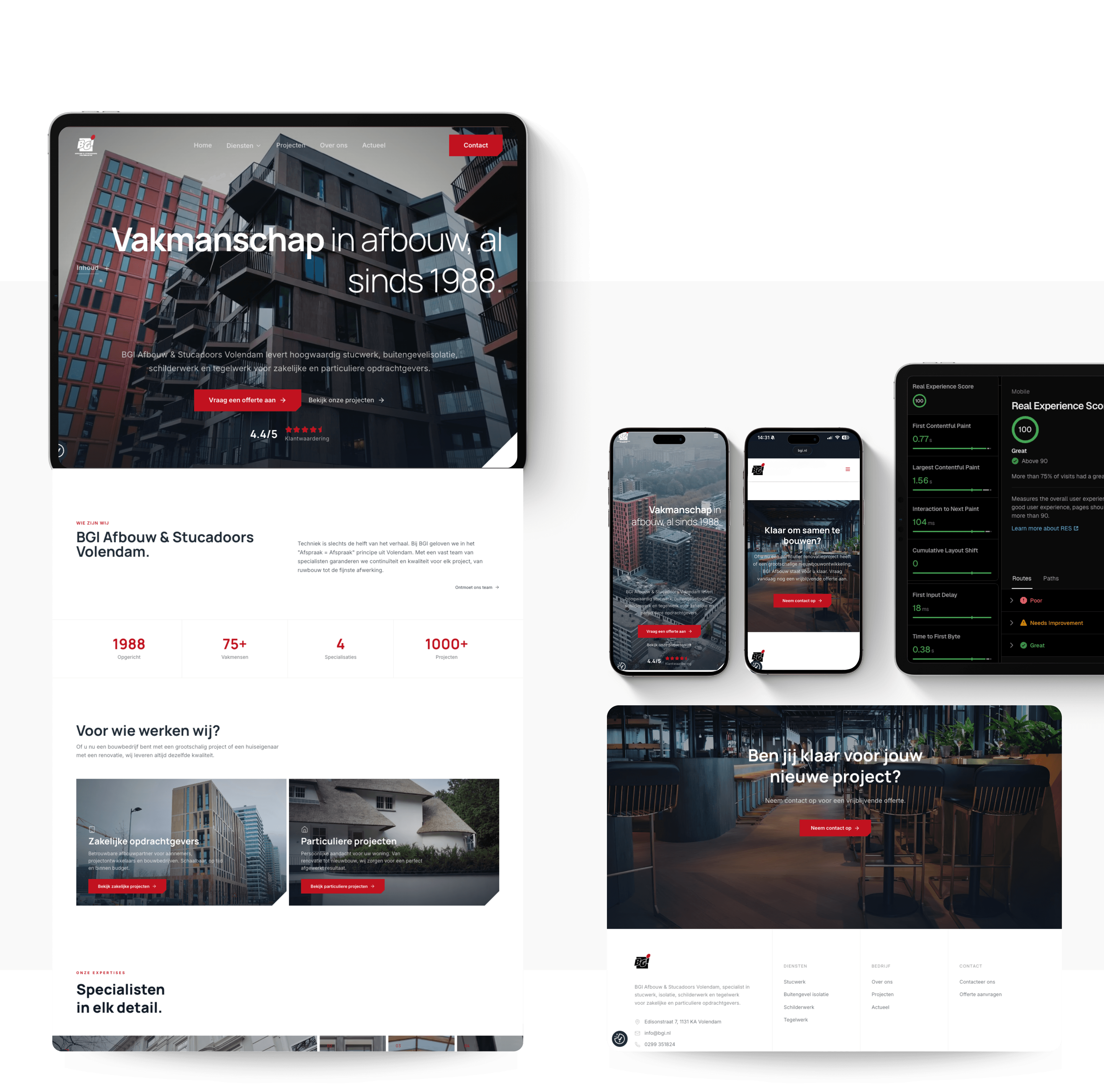
The new look matches BGI's brand values: crisp, businesslike, reliable and corporate. We brought colour and typography together into one recognisable system across all four disciplines. Within that system, each service was given its own logo and accent colour.
Design and build on a headless architecture
We built the website with Next.js and Sanity as the editing environment, and deliver it through Vercel. The content sits apart from the technology, so updates no longer depend on a fragile plugin layer. BGI can manage the entire website itself, from services and specialisms through to projects and certifications.
SEO and GEO
SEO was built in from the start: URL mapping, search intent, a pillar and spoke structure, internal linking and the commercial lead route. For GEO we set up priority pages with direct answers, relevant definitions, sources, evidence from practice and FAQs. That way the website helps visitors and AI systems alike to understand BGI's expertise.
03 — Design System
Typography & colour
The colour palette comes straight from BGI's brand briefing and forms the basis of the website design. The dark blue-black reinforces the businesslike presence BGI is after and returns in the navigation, the hero overlays and the section headings. The brick red is used sparingly, for primary buttons and the most important accents. On top of that, each service has its own accent colour, such as a separate colour for painting and for tiling. Plastering and external wall insulation carry BGI's familiar red. Tiling and painting have their own logo, and that comes with its own accent colour. That accent sits on the buttons, the links and the markers of the service page and of every specialism beneath it. So you can see at a glance which part of BGI you have landed on. The brand does not fall apart because of it: the base colours, the typography and the structure stay the same throughout. Alongside the colours below, the site uses two calm surface colours: Parchment #F6F3EE and Dust grey #E7E0D8.
Primair
#1F2A37
#111827
Secundair
#C1121F
#77B92A
#482576
#FFFFFF
Aa
Manrope
Aa
Inter
Speed is key
For maximum performance and visibility we built a blazing-fast headless website.
Mobile 1st
Speed Insights
Real Experience Score
About BGI Afbouw
From its base in Volendam, BGI Afbouw & Stucadoors handles the complete finishing of buildings, inside and out, for new build and renovation. The company brings plastering, external wall insulation, painting and tiling together under one roof and works for contractors, property developers, housing associations and private clients with large building plans. BGI is NOA, VCA and KIWA-KOMO certified and won the 2019 KwaliteitsAward Gevelsystemen, awarded on the lowest number of shortcomings found during independent project inspections.
Rather check where your website is falling behind first?
Ready to start straight away? Then request our website scan, with no obligation. We look at where your website currently falls short on structure, speed, visibility (SEO/GEO) and conversion. You get a short summary of the main points to address, so you know where your website can improve.
Request information, no obligation